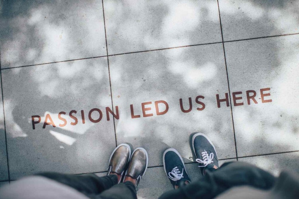
A Friendly Hello Before We Begin
Hello and welcome.
I hope you are doing well and working on improving your LinkedIn profile.
Your LinkedIn banner is one of the first visual elements people notice when they open your profile. Many users either ignore it or upload the wrong image size, which makes the profile look unprofessional. A properly sized and well-designed banner can instantly improve how your profile feels to recruiters and visitors.
This article will help you understand the correct LinkedIn banner size and how to use it effectively.
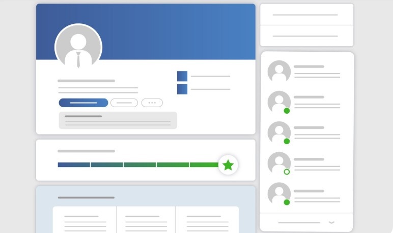
What Is a LinkedIn Banner and Why It Matters
The LinkedIn banner, also called the cover photo, appears at the top of your profile behind your profile picture.
A good banner helps you:
- Create a strong first impression
- Show professionalism
- Support your personal brand
- Make your profile visually complete
Even small visual improvements can make a big difference.
Correct LinkedIn Banner Size
The recommended LinkedIn banner size is:
- 1584 x 396 pixels
- Aspect ratio: 4:1
- File formats: JPG or PNG
- Maximum file size: 8 MB
Using the correct size prevents your image from being cropped or blurred.
Why Using the Right Banner Size Is Important
When the banner size is incorrect:
- Important text gets cut off
- Images look stretched or blurry
- Profile appears unfinished
A properly sized banner keeps your profile clean and professional.
How Recruiters See Your Banner
Recruiters do not analyze banners deeply, but they notice them subconsciously. A clean banner creates a positive feeling, while a messy one creates doubt.
Your banner should support your profile, not distract from it.
What to Include in a LinkedIn Banner
A good LinkedIn banner can include:
- Your profession or role
- Key skills or services
- A simple tagline
- Brand colors
Keep it simple and readable.
What to Avoid in a LinkedIn Banner
Avoid:
- Too much text
- Low-quality images
- Personal photos
- Crowded designs
A minimal design always looks more professional.
Banner Design Tips for Job Seekers
If you are job searching:
- Use calm colors
- Highlight your role or field
- Avoid sales-style slogans
Your banner should reflect clarity and confidence.
Banner Design Tips for Professionals
If you are working professionally:
- Use branding colors
- Show expertise or niche
- Keep consistency with your profile tone
Consistency builds trust.
How Banner Size Affects Mobile View
Many people view LinkedIn profiles on mobile. A correct banner size ensures your image looks good on both desktop and mobile.
Always keep important content centered to avoid cropping.
ATS and LinkedIn Banners
ATS systems do not read banners, but recruiters still form impressions visually. A strong banner supports your written profile and makes it more inviting.
Optimization is about the full picture.
Common LinkedIn Banner Mistakes
Many profiles suffer because:
- Default blue banner is left unchanged
- Incorrect dimensions are used
- Text is placed too high or too low
Fixing these small issues improves your profile immediately.
Learn More From LinkedIn Optimization Blogs
If you want to make the most of LinkedIn, learning small details like banner size, headline structure, and About section writing helps a lot.
Knowledge turns an average profile into a strong one.
Final Thoughts on LinkedIn Banner Size
Your LinkedIn banner is a simple but powerful element. Using the right size and design shows professionalism and attention to detail.
Small improvements create strong impressions.